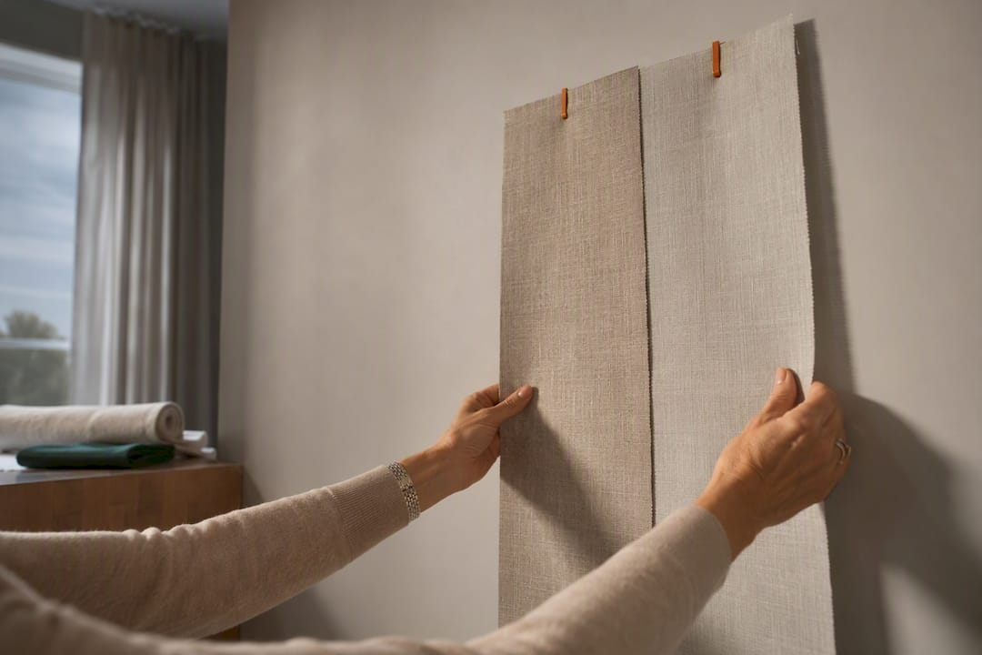
Curtains do not need to match the wall exactly, and in most rooms they shouldn’t. The reliable rule is tone-on-tone: pick a curtain within the same color family as your wall, then shift one shade lighter or darker for depth. Break that rule only when you want the window itself to become a focal point, in which case a deliberate contrast color earns its place
TL;DR:
- Curtains should generally be in the same color family as the wall but a shade lighter or darker to create a subtle, cohesive look.
- Identifying the wall’s undertone, whether warm or cool, is crucial, as neglecting this can make the pairing look mismatched or muddy.
- Room lighting and window orientation significantly influence how curtain color appears, with north-facing rooms benefiting from warmer tones.
- Fabric choice, weave, texture, and lining impact how the color reads once hung, emphasizing the importance of testing full-size samples in your room lighting.
- Hardware and mounting height alter the visual effect of curtains, so choose hardware finishes and installation strategies that support your desired tone-on-tone or contrasting style.
Table of Contents
- The Core Principles Behind Matching Curtains to Wall Color
- Quick Pairing Guide: Curtain Colors for Common Wall Shades
- How Fabric, Texture, and Lining Change the Way Color Reads
- How to Test a Curtain Color Before You Commit
- Hanging and Styling Choices That Change the Effect
- Verifying Your Color Choice With Beautiful Windows Elgin
- Do Curtain Patterns Work on Solid or Patterned Walls?
- Matching Curtain Style to Your Room’s Furniture Palette
- Do Curtain Rods and Hardware Affect the Color Pairing?
- Adjusting Curtain Colors for the Seasons
- Coordinating Curtains When Walls Have Multiple Colors
- A Designer’s Quick Checklist for Match vs. Contrast
- Order Fabric Samples or Book a Design Consultation
- Sources
- FAQ
The Core Principles Behind Matching Curtains to Wall Color
A monochromatic pairing, one where the curtain sits in the same color family as the wall but a shade off, works consistently across both quiet neutral rooms and bolder, saturated ones, according to Apartment Therapy. It’s a low-risk formula because it never fights the wall for attention. But “same family” only works if you’ve correctly identified the wall’s undertone first.
Every paint color carries a hidden undertone, warm or cool, even the ones that look neutral on the swatch card. A greige wall might lean pink, yellow, or green depending on the light hitting it, and a curtain that ignores that undertone will look slightly off no matter how close the shade match seems on paper. This is why two “gray” curtains can read completely differently in the same gray room.
Light changes the equation again. Morning sun, afternoon glare, and evening lamp light all shift how a color appears, sometimes dramatically. A curtain that looks warm and inviting at 10 a.m. can look muddy under a cool-toned LED bulb at night. Rooms with north-facing windows tend to get flatter, cooler light all day, which makes warm-toned curtains especially useful for balancing the space.
Whether to go tone-on-tone or full contrast comes down to what the room needs to do. A bedroom or small den usually benefits from the calmer, quieter effect of a close match, according to Livingetc’s designer roundup. A living room with one striking window, or a room that otherwise feels flat, is a better candidate for a curtain that pops.
Scale and pattern matter just as much as color. A large-scale print on a small window will fight the wall regardless of color coordination, while a subtle textured solid nearly always blends.
- Warm undertones (yellow, pink, orange base) pair best with curtains that share that warmth, even in a different value.
- Cool undertones (blue, green, gray base) need a curtain with a matching cool cast, or the pairing looks muddy.
- North-facing rooms benefit from warmer curtain tones to offset flat daylight.
- Rooms with heavy pattern or texture on the wall need a simpler, solid curtain to avoid visual clutter.
Pro Tip: Test your wall’s undertone by holding a pure white sheet of paper against it in daylight. Whatever color the wall seems to “lean toward” next to true white is its real undertone, and that’s the color family your curtain should join.
Quick Pairing Guide: Curtain Colors for Common Wall Shades
Wall color and curtain color don’t need an exact formula, but certain pairings show up again and again in well-designed rooms because they work with, not against, the wall’s undertone. HomeDesignLeader points out that curtains take up nearly as much visual real estate as the wall itself, so getting the pairing right changes the whole feel of a room.
White walls. White is the most forgiving backdrop of all. Because it has almost no competing undertone, according to HomeDesignLeader, you can go soft (oatmeal or ivory linen for a blend), moderate (a dusty sage or blush for gentle contrast), or bold (navy or terracotta for a statement panel). Let your furniture palette decide, not the wall.
Beige and greige walls. Warm beige wants curtains in cream, camel, or warm taupe. Cool greige wants curtains in dove gray, soft blue, or oatmeal with a gray cast. Mixing warm curtains onto a cool greige wall is the single most common mismatch homeowners make.
Gray walls. A lighter or darker gray curtain keeps things tone-on-tone and calm. For contrast, mustard yellow or a deep plum reads as intentional rather than accidental, especially in a linen or cotton weave that softens the gray’s coolness.
Blue walls. Stay in the family with a lighter powder blue or slate curtain for a serene bedroom feel. For contrast, warm white or a soft coral panel breaks up a blue room without clashing.
Green walls. Sage and olive walls pair beautifully with warm white or natural linen curtains for blend, or with rust and burnt orange for a bold, earthy accent.
Yellow walls. Keep it tonal with a softer buttery or cream curtain, or contrast with a charcoal or navy panel that grounds a bright, sunny room.
Terracotta walls. Cream, warm white, or a lighter terracotta curtain keeps the look cohesive. For contrast, deep teal or forest green plays off terracotta’s warmth without competing.
Dark charcoal or black walls. These dramatic walls almost always look best with curtains that lighten the room rather than deepen it further, think warm white, soft gold, or a pale linen that reads as relief rather than repetition. A dark curtain against a dark wall can work, but only in a room with strong artificial lighting to prevent the space from disappearing at night.
A few fabric notes worth flagging as you shortlist colors, especially when considering how your interior design personality influences your curtain choices:
- Linen and cotton soften any color choice and work well for both blend and contrast strategies.
- Satin and jacquard add sheen that intensifies color, so a “medium” shade in satin often reads bolder than the same shade in a matte weave.
- Bold accent colors read best in a mid-weight fabric that holds its shape; sheer or very lightweight fabric in a saturated color can look washed out.
How Fabric, Texture, and Lining Change the Way Color Reads
The color on a fabric swatch is never the whole story. Weave and texture bend how a color behaves once it’s hanging: linen tends to soften a shade and make it look airier, while velvet deepens the same color and adds visual weight. A navy linen curtain and a navy velvet curtain in the identical dye lot will look like two different colors once they’re on the window.
Sheen matters too. Satin and jacquard fabrics catch light and intensify undertones, sometimes making a warm color look richer than expected and a cool color look almost metallic under certain bulbs. Matte fabrics like cotton and heavier linen stay closer to true color regardless of lighting shifts.
Lining is the part most DIY decorators skip, and it’s a mistake. Lining shifts how a color reads from both inside and outside the room, adds insulation, and controls privacy. Standard lining keeps the fabric’s color mostly true while adding basic opacity, while blackout lining darkens a room fully and can slightly deepen the front-facing color. Thermal lining adds warmth retention for cold climates, according to Thelights, which matters as much for comfort as for looks.
- Bedrooms: blackout-lined velvet or heavier cotton for privacy and a cocooning feel.
- Living rooms: medium-weight linen or cotton with standard lining for everyday light control.
- Small spaces: lightweight linen without heavy lining, to avoid visually shrinking the room.
Our guide to curtain color and room mood walks through how these material choices shift the emotional tone of a space, not just its color accuracy.
How to Test a Curtain Color Before You Commit
Skip the tiny paint-chip-sized swatch. A color that looks perfect on a 2 inch square can look entirely different across six feet of hanging fabric, so a full sample panel or a large swatch is worth the wait.
- Get a large sample. Request a full-width swatch or panel rather than a small cutting, since fabric color intensifies with volume.
- View it at three different times. Check the sample in morning light, afternoon light, and under your evening lamps, since all three will shift the color noticeably, a point Apartment Therapy also flags as a common ordering mistake.
- Hold it against your furniture. Bring the sample near your sofa, rug, and any wood tones in the room, then step back several feet to see how it reads from a normal viewing distance.
- Decide fullness and width before you finalize color. A fabric that looks thin at standard width can look richer and more saturated once cut to proper fullness.
- Consider layering sheers. If you’re unsure between a bold and subtle direction, a sheer panel underneath gives you flexibility to add or remove drama later without reordering.
Pro Tip: If you can, pin the sample panel where the finished curtain will actually hang, even for a day, so you can watch how the color moves with real light rather than judging it flat against a wall.
Our window treatment measurement guide covers the width and fullness math in more detail once you’ve settled on a color direction.
Hanging and Styling Choices That Change the Effect

How you hang a curtain changes its color story almost as much as the fabric choice itself. Mounting the rod high and wide, several inches above the window frame and extending past the edges, makes the window look larger and gives a tone-on-tone pairing room to breathe instead of looking cramped, a technique Chris Loves Julia recommends for nearly every room type.
Floor-length panels read as more intentional than sill-length ones, especially in a close-match color scheme, because the extra fabric adds the visual weight a subtle color needs to register as a design choice rather than an afterthought. As a general rule of thumb, aim for panels roughly 1.5 to 2 times the width of the rod so the fabric falls in soft folds rather than pulling flat.
- Keep hardware and panel color consistent across multiple windows in the same room, even if the windows are different sizes.
- Repeat a patterned panel on every window in a room rather than mixing solid and print, unless one window is clearly meant to stand apart.
- Higher rod placement suits both matching and contrasting color schemes, but it matters most when the curtain color is close to the wall.
Verifying Your Color Choice With Beautiful Windows Elgin
Confirming a curtain color before you commit is easier with real fabric in hand. There are curated designer fabrics by the yard, including jacquard satin, embroidered, and upholstery textiles, along with fabric samples built for exactly this kind of in-room testing.
Beyond samples, there are personalized design consultations, nationwide shipping, and installation guidance to help you settle on the right color and finish with fewer guesses. Before a consultation, gather a few photos of your wall in daylight and lamp light, note your furniture colors, and have your window measurements ready so the conversation can move straight to fabric and finish.
Do Curtain Patterns Work on Solid or Patterned Walls?
A patterned curtain on a solid wall almost always works, since the wall gives the eye a resting place before it lands on the print. Small florals, subtle stripes, and geometric prints all read cleanly against a single wall color, especially when at least one color in the print echoes the wall’s undertone.
Patterned walls are trickier. Wallpaper, an accent mural, or a heavily textured paint finish usually call for a solid curtain, since two competing prints in the same sightline create visual noise rather than interest. If you love a patterned wall and still want a patterned curtain, pull the curtain’s dominant color directly from the wallpaper’s background shade so the two patterns share a common thread instead of clashing outright.
The safest cross-pattern move is scale contrast: a large-scale wallpaper pairs better with a small, quiet curtain print than with another large-scale pattern. The reverse also holds, a busy small-scale wallpaper calms down next to a curtain with bigger, simpler shapes.
Matching Curtain Style to Your Room’s Furniture Palette
Curtains have to answer to more than the wall. Designers stress checking new curtain fabric against the room’s furniture, flooring, and rugs before locking in a color, since a curtain that matches the wall perfectly can still clash with a sofa or an area rug, according to Livingetc.
Start by identifying the room’s dominant neutral, whether that’s a warm wood floor, a gray sofa, or a cream rug, and choose a curtain that sits comfortably within that same temperature range. A cool-toned curtain in a room full of warm wood tones will look like an outlier even if it matches the wall exactly.
If your furniture palette already has one bold color, let the curtain either echo it in a softer tint or stay neutral and let the furniture carry the color statement. Rooms rarely need two competing “loud” elements. Rugs are often the easiest bridge: pulling a curtain color from a pattern already present in an area rug ties the whole room together without requiring an exact wall match.
Do Curtain Rods and Hardware Affect the Color Pairing?
Hardware color changes how curtains and walls read together more than most homeowners expect. A dark bronze or black rod against a light wall creates a visible frame that draws attention to the transition between wall and curtain, which sharpens contrast pairings but can make a tone-on-tone scheme look choppier than intended.
For a seamless blend look, choose rod and ring hardware that matches or nearly matches the wall color, so the eye reads curtain and wall as one continuous plane. For a bold contrast look, matching the hardware finish to the curtain’s accent color, rather than the wall, reinforces the intentional statement instead of looking like a mismatched accident.
Tiebacks, trim, and decorative tape also shift perception. A contrast-color trim on an otherwise tone-on-tone curtain adds just enough definition to keep a subtle pairing from looking flat, while ornate hardware on a minimalist color scheme can visually overpower a curtain that was meant to recede.
Adjusting Curtain Colors for the Seasons
Curtain color doesn’t have to be a permanent decision. Many homeowners keep two sets: a heavier, warmer-toned panel for fall and winter, and a lighter, breezier fabric for spring and summer, swapping them the way you might swap a throw blanket or rug.
Warmer months favor lighter linens and cottons in soft neutrals, pale blues, or gentle greens, colors that keep a room feeling airy when natural light is already abundant. Cooler months suit richer tones, deep rust, forest green, or burgundy, paired with heavier fabric that adds a sense of warmth even before you touch the thermostat.
If keeping two full sets of curtains isn’t practical, seasonal throw pillows, a table runner, or a slipcover can carry the seasonal color shift instead, leaving the curtains as a neutral, tone-on-tone constant year round. That approach also protects your original wall and curtain pairing from ever feeling dated by a passing color trend.
Coordinating Curtains When Walls Have Multiple Colors
An accent wall or a multi-tone room complicates the tone-on-tone rule, but it doesn’t break it. The most reliable approach is choosing your curtain color to match the room’s dominant wall color, the one covering the most square footage, rather than the accent shade, even if the accent wall is the one behind the window.
If the window itself sits on the accent wall, a curtain that echoes the surrounding walls’ color instead of the accent tends to look more intentional, since it keeps the accent wall as the statement rather than competing with it. Alternatively, pulling one supporting color from the accent wall, rather than its dominant hue, for the curtain creates a subtle bridge between the two palettes without fully matching either.
For rooms with genuinely multiple wall colors and no clear dominant shade, defer to the furniture palette instead of the walls entirely. A neutral curtain in warm white, oatmeal, or soft gray almost always resolves a busy, multi-color wall situation without adding another competing tone into the mix.
A Designer’s Quick Checklist for Match vs. Contrast
Before you order fabric, answer three questions: Does this window need to be a focal point, or recede? Is the room already bright, or does it need visual lift? Do you want the space to feel calm or energized? Tone-on-tone answers the first two with “recede” and “calm.” Contrast answers with “focal point” and “energized.” Order a sample either way before you commit.
— Marrion
Order Fabric Samples or Book a Design Consultation
Guesswork is the expensive part of choosing curtain color, not the fabric itself. A way to skip the guesswork entirely is offered: order real designer fabric samples, jacquard satin, embroidered, or upholstery weaves, and hold them against your own wall before you commit to a single yard.

Design consultations walk you through undertone, lighting, and lining questions specific to your room, then support you through measurement and installation so the color you approve on a swatch is the color you get on the finished panel. If you’re ready to move past paint chips and lighting guesses, browse the curated upholstery and drapery fabric collection or start with a measurement and ordering consultation to get your exact window specs into expert hands.
Sources
- Here’s Why Matching Your Curtains to Your Wall Color Works | Apartment Therapy
- What Color Curtains Go With Your Walls? 15 Ideas | HomeDesignLeader
- Should curtains match your wall color? We ask the designers | Livingetc
- How to Choose Curtains for Light, Privacy, Warmth | Chris Loves Julia
FAQ
Should Your Curtains Match Your Walls?
Curtains don’t need to match exactly, and a slight tonal shift within the same color family, one shade lighter or darker, usually looks better than an exact match, according to Apartment Therapy.
Should Curtains Be Lighter or Darker Than the Walls?
Either works: lighter curtains open up a room and soften contrast, while darker curtains add depth and make a window feel more grounded. Choose based on how much natural light the room already gets and whether you want the window to recede or stand out.
What Should Curtains Match, the Wall or the Furniture?
Curtains should coordinate with the room as a whole, not just the wall, pulling color cues from furniture, rugs, and flooring so the whole space feels connected, a point designers emphasize repeatedly, according to Livingetc.
How Do You Match Wall Color With Curtains?
Start by identifying the wall’s undertone, then choose a curtain in the same warm or cool family, adjusting the value up or down for tone-on-tone, or picking a deliberate contrast color if the window should be a focal point. Ordering a large fabric sample from a source like Beautifulwindowselgin and testing it in your actual room light confirms the choice before you buy.
Leave a Reply