TL;DR:
- Matching fabrics involves using color, pattern, texture, and weight to create a cohesive look in home decor projects. Applying proven rules like the 60-30-10 color ratio and 40-40-20 pattern scale ratio ensures harmony and visual hierarchy. Testing fabric combinations in natural light helps prevent undertone clashes and confirms compatibility before purchase.
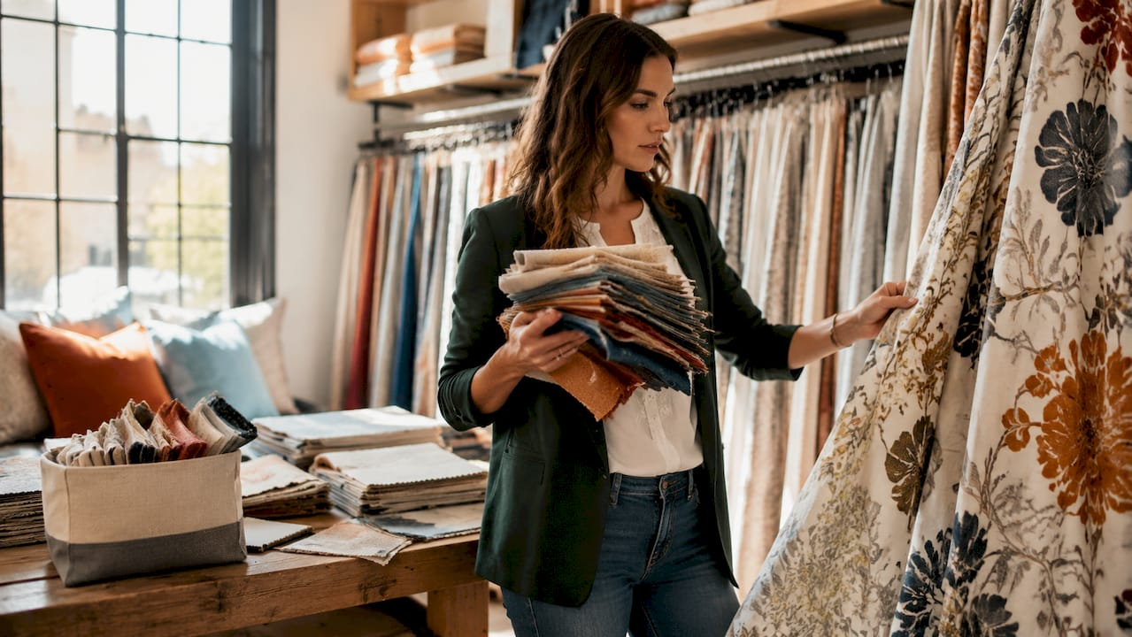
Matching fabrics is the coordinated use of color, pattern, texture, and weight to create a visually harmonious result in upholstery, drapery, and home décor projects. Professional designers call this process textile coordination, and it follows proven structural rules rather than guesswork. When you understand how to match fabrics using those rules, every room you design gains cohesion and depth. The principles covered here apply whether you are reupholstering a sofa, hanging custom drapes, or layering decorative accents across a living space.
How to match fabrics using color coordination
Color is the first thing the eye reads in any room, which makes fabric color coordination the foundation of every successful pairing. The most reliable framework is the 60-30-10 rule: allocate 60% of your fabric choices to a dominant color, 30% to a secondary color, and 10% to an accent. This ratio prevents any single color from overwhelming the space while still giving the room a clear visual identity.
Color wheel relationships define which hues work together. The three most useful schemes for home décor are:
- Complementary: Colors directly opposite on the wheel, such as navy and burnt orange, create high contrast and energy.
- Analogous: Colors sitting side by side, such as sage green, olive, and warm gold, produce a calm, layered effect.
- Monochromatic: Variations of a single hue in different tones and textures deliver sophistication without visual noise.
Undertones matter as much as the main color. A cream fabric with pink undertones will clash with a white fabric that reads cool and blue. Warm undertones (yellow, red, orange) pair with other warm tones; cool undertones (blue, green, gray) pair with cool tones. Neutral fabrics in warm ivory or cool white serve as anchors that let bolder fabrics breathe.
Lighting changes everything. A fabric that reads as soft taupe under a showroom’s fluorescent lights can shift to a greenish gray in your north-facing living room. View fabric combinations in the actual room under natural light at different times of day before committing to a purchase.
Pro Tip: Photograph your fabric swatches against the wall color in the morning and again in the evening. The two photos will reveal any undertone conflicts that are invisible under store lighting.

What is the best way to mix patterns and scale?
Pattern mixing is where most homeowners lose confidence, but the process follows a clear ratio. Professional-level pattern mixing uses a 40-40-20 rule: 40% large-scale pattern, 40% medium-scale pattern, and 20% small-scale pattern or solid fabric. This ratio creates visual hierarchy and prevents the chaotic effect that comes from placing too many competing prints at the same size.

Scale is the key variable. A large-scale botanical print on a sofa pairs well with a medium-scale geometric on throw pillows and a small-scale texture or solid on drapery. Each fabric occupies a different visual “lane,” so the eye moves through the room rather than stopping at a single busy focal point.
Combining organic and geometric patterns is one of the most reliable mixing strategies. A curved, flowing floral and a structured grid or stripe share no visual similarity, which means they complement rather than compete. Mixing two florals of the same scale, by contrast, creates visual confusion.
| Pattern type | Scale | Best use in home décor |
|---|---|---|
| Large-scale botanical or damask | 40% | Sofa upholstery, accent chair, statement drapes |
| Medium-scale geometric or stripe | 40% | Throw pillows, roman shades, bench cushions |
| Small-scale texture or solid | 20% | Drapery lining, trim, decorative accents |
Solids are not a fallback. A solid velvet or a woven jacquard satin in a rich color carries as much visual weight as a printed fabric. Use solids deliberately as a resting point for the eye between two active patterns.
Pro Tip: Lay all your fabric swatches flat on the floor in the proportions you plan to use them. The 40-40-20 ratio becomes immediately visible, and you can swap fabrics before cutting a single yard.
Why do fabric weight, drape, and texture matter?
Fabric weight and drape are technical properties that directly affect how a finished project looks and holds up over time. Mixing heavy upholstery fabrics with delicate drapes requires special sewing techniques or structural reinforcements. Ignoring weight compatibility is the leading cause of upholstery and window treatment project failures, from puckered seams to sagging panels.
Fiber content drives compatibility. Matching fiber content within the same family, such as cotton with cotton or linen with linen, avoids seam distortion and ensures consistent shrinkage and drape. When you mix fiber families, the fabrics respond differently to humidity, heat, and washing, which creates long-term structural problems. The role of fabric weight in home décor projects is a subject worth studying before you purchase yardage for any structural application.
Texture adds depth that color alone cannot deliver. Mixing tactile opposites such as rough linen with smooth satin creates visual interest even in a monochromatic color scheme. The contrast between matte and light-reflective surfaces gives the eye something to explore without adding more color or pattern. For a deeper look at how texture shapes a room’s character, the role of fabric texture in interior design covers the subject in full.
The practical steps for working with different weights and textures are:
- Check the GSM (grams per square meter) of each fabric before pairing them. Upholstery fabrics typically run 300–600 GSM; drapery fabrics run 150–300 GSM.
- Match fiber content within the same project wherever possible to avoid differential shrinkage.
- Use interfacing or lining to stabilize lighter fabrics when they must be sewn alongside heavier ones.
- Test drape by holding the fabric vertically. A fabric that falls in clean folds will behave predictably as a curtain panel; one that stiffens or bunches will not.
Step-by-step process for selecting and matching fabrics
A reliable workflow removes the guesswork from fabric selection. The process professionals use follows a fixed sequence that you can apply to any upholstery, drapery, or décor project.
Step 1: Choose your anchor fabric. Selecting a bold, multi-colored print as your hero fabric first is the most effective way to coordinate supporting fabrics. The anchor fabric sets the color palette, the mood, and the pattern scale for everything else. A jacquard satin with deep teal, gold, and ivory gives you three colors to work with and a scale reference for all supporting patterns. For guidance on selecting a focal fabric, the decorative fabric guide for homeowners is a practical starting point.
Step 2: Build a swatch collection. Pull fabric samples in the colors and patterns suggested by your anchor fabric. Aim for at least five to seven swatches before narrowing down. Include at least one solid and one texture-forward fabric in the group.
Step 3: Apply the 60-30-10 and 40-40-20 ratios. Assign each swatch a role: dominant, secondary, or accent for color; large, medium, or small scale for pattern. Fabrics that do not fit a clear role are cut from the selection.
Step 4: Test under natural light in the room. Photograph the swatch grouping in the morning and evening. Confirm that undertones remain compatible across lighting conditions.
Step 5: Document before you order. Professional designers maintain logs tracking dye lots, fiber content, and GSM for every fabric in a project. This prevents color and texture mismatches when ordering additional yardage later.
| Step | Action | Checkpoint |
|---|---|---|
| 1. Anchor fabric | Select one bold, multi-colored print | Sets color palette and pattern scale |
| 2. Swatch collection | Gather 5–7 supporting samples | Includes at least one solid and one texture |
| 3. Apply ratios | Assign 60-30-10 and 40-40-20 roles | Every fabric has a defined role |
| 4. Light test | Photograph swatches in the room | Undertones confirmed under natural light |
| 5. Document | Log dye lots, fiber content, GSM | Prevents mismatches on repeat orders |
Common mistakes to avoid include skipping the anchor fabric step, mixing too many patterns at the same scale, and purchasing all yardage from a single dye lot without recording the lot number. The window fabric coordination workflow from Beautifulwindowselgin expands on this process specifically for window treatments.
Key Takeaways
Successful fabric matching depends on applying the 60-30-10 color rule, the 40-40-20 pattern scale ratio, and compatible fabric weights before purchasing a single yard.
| Point | Details |
|---|---|
| Start with an anchor fabric | Choose one bold, multi-colored print to set the color palette and pattern scale for the whole project. |
| Use the 60-30-10 color rule | Assign 60% dominant, 30% secondary, and 10% accent fabric to keep color balanced across the room. |
| Apply the 40-40-20 pattern ratio | Mix large, medium, and small-scale patterns in this proportion to create visual hierarchy without clashing. |
| Match fabric weight and fiber content | Pairing fabrics within the same fiber family prevents seam distortion, puckering, and uneven drape. |
| Test swatches under natural light | Photograph fabric groupings in the actual room at different times of day to confirm undertone compatibility. |
What I have learned from years of working with fabric combinations
The rule I see homeowners skip most often is the anchor fabric step. They arrive with five beautiful swatches that share no common thread, and the result is a room that feels restless rather than composed. Choosing one dominant, multi-colored fabric first is not a limitation. It is the decision that makes every other choice easier.
The second mistake I see consistently is ignoring undertones. Two fabrics can share the same named color and still clash because one reads warm and the other reads cool. I always tell clients to hold their swatches next to a pure white sheet of paper. The undertone becomes immediately visible, and the decision becomes obvious.
That said, design rules are a framework, not a ceiling. Once you understand the 60-30-10 and 40-40-20 ratios, you can break them deliberately and with confidence. A room that runs 70% dominant color with almost no accent can feel intentionally dramatic. A room that mixes four patterns at similar scales can feel maximalist and curated if the colors are tightly controlled. The rules tell you what the eye expects. Knowing them lets you decide when to meet that expectation and when to subvert it.
The single most underused tool in fabric matching is natural light testing. Fabrics look different at 8 a.m. than they do at 6 p.m., and no showroom replicates your specific room’s light. Take swatches home. Live with them for two days. The right combination will confirm itself.
— Marrion
Explore Beautifulwindowselgin’s fabric collection for your next project
Beautifulwindowselgin carries a curated selection of designer fabrics suited to every stage of the matching process, from bold anchor prints to refined solids and textured weaves. The collection includes jacquard satin, embroidered fabrics, and upholstery textiles sold by the yard, with options spanning a wide range of weights and fiber types.

For upholstery projects, the upholstery and drapery fabric collection offers multi-color textiles that work as anchor fabrics or supporting layers. For window treatments, the designer drapery fabrics collection features 389-GSM options built for structure and drape. Beautifulwindowselgin also provides custom drapery making services and design consultations, with nationwide shipping available for every order.
FAQ
What is the 60-30-10 rule in fabric matching?
The 60-30-10 rule allocates 60% of fabric choices to a dominant color, 30% to a secondary color, and 10% to an accent. This ratio creates a balanced, cohesive color palette across upholstery, drapery, and décor.
What fabrics match well together for upholstery and drapery?
Fabrics within the same fiber family, such as cotton with cotton or linen with linen, match well because they share compatible weight, drape, and shrinkage rates. Pairing a large-scale patterned upholstery fabric with a solid or small-scale drapery fabric in a coordinating color is a reliable combination.
How do you mix patterns without clashing?
Use the 40-40-20 ratio: 40% large-scale pattern, 40% medium-scale pattern, and 20% small-scale pattern or solid. Combining organic patterns like florals with geometric patterns like stripes also reduces visual conflict because the shapes do not compete.
Why does fabric weight matter when matching fabrics?
Mismatched fabric weights cause seam distortion, puckering, and uneven drape in finished projects. Matching fabrics within the same weight range and fiber family produces consistent results and avoids structural failures in upholstery and window treatments.
How do I test fabric combinations before buying?
Collect physical swatches and place them together in the room where they will be used. Photograph the grouping under natural light in the morning and evening to confirm that colors and undertones remain compatible across different lighting conditions.
Recommended
- Upholstery Fabric Types: A Practical Guide for 2026 – Fabric Store in Columbia, SC | Drapery Making Services
- Drapery Fabric Selection Guide for Custom Window Treatments – Shop Designer Fabrics by the Yard | Curtains & Drapery
- Brown Fabric by the Yard for Upholstery & Drapery – Fabric Store in Columbia, SC | Drapery Making Services
- Orange Fabric by the Yard for Upholstery & Drapery – Fabric Store in Columbia, SC | Drapery Making Services
Leave a Reply