TL;DR:
- Applying the 60-30-10 rule ensures balanced textile layering in interior design. Mixing at least three pattern scales and contrasting matte with shiny fabrics creates depth and richness. Testing fabric samples in your space helps prevent costly decorating mistakes.
Decorative textile tips are strategic methods for layering and styling fabrics to create interiors that feel intentional, warm, and visually rich. The 60-30-10 rule is the foundational standard for textile proportion in home décor, dividing fabrics into dominant, secondary, and accent layers. Mixing at least three pattern scales and combining tactile contrasts prevents visual flatness and adds professional depth. Beautifulwindowselgin works with homeowners and DIY decorators who want to apply these principles using quality fabrics that hold up beautifully over time.
1. How to apply the 60-30-10 rule to textile layering
The 60-30-10 rule is the single most reliable framework for balancing textiles in any room. It divides your fabric choices into three proportional layers: 60% dominant anchor, 30% secondary texture, and 10% statement accent. Following this ratio prevents rooms from feeling either too flat or too busy.

The 60% anchor layer
Your anchor textile sets the room’s visual mood and texture scale. This is typically the sofa fabric, a large area rug, or floor-length curtains. Starting with one dominant anchor textile directs every other fabric decision that follows. In a living room, a linen sofa in warm ivory serves as a clean, neutral base that accepts almost any secondary layer.
The 30% secondary layer
Secondary textiles add depth without competing with the anchor. Bedding, accent chairs, throws, and upholstered ottomans all fall into this category. A bedroom anchored by white cotton bedding pairs well with a 30% layer of wool or boucle in a complementary tone. The secondary layer is where you introduce a contrasting texture, such as a nubby weave against a smooth base.
The 10% accent layer
Accent textiles carry the most visual punch per square inch. Decorative pillows, table runners, trims, and embroidered cushion covers all qualify. This 10% layer is where you can afford to be bold with color, pattern, or fabric technique. A common mistake is overloading this layer, which dilutes its impact. Keep it edited.
Pro Tip: Order fabric swatches and place them in the room at different times of day before committing. Colors and textures read very differently under morning light versus evening lamp light.
2. What are the best strategies for mixing patterns and textures?
Mixing at least three pattern scales — large, medium, and small — creates professional visual hierarchy without clutter. A large-scale geometric on a rug, a medium floral on a throw pillow, and a small-scale stripe on a lumbar cushion work together because each occupies a different visual frequency. Color harmony ties them together.
Pattern scale combinations that work
| Pattern Scale | Example Fabric | Texture Type |
|---|---|---|
| Large | Jacquard weave curtain | Smooth, structured |
| Medium | Embroidered throw pillow | Dimensional, tactile |
| Small | Woven stripe cushion cover | Flat, fine |
| Accent | Velvet trim or piping | Luminous, soft |
Tactile contrast matters as much as visual pattern. Combining smooth and nubby textures creates the kind of depth that photographs well and feels rich in person. A linen sofa paired with a chunky wool throw and a silk accent pillow hits three distinct tactile registers at once.
Color harmony is the glue that holds mixed patterns together. Choose a consistent palette of two or three colors and let each pattern carry those colors in different proportions. A navy and cream palette, for example, can unify a bold geometric, a delicate ticking stripe, and a solid velvet without any of them clashing.
Mixing matte, light-absorbing fabrics with luminous ones creates visual depth and richness that a single fabric type cannot achieve. Raw linen next to silk or velvet enhances the luxurious feel of a layered interior. This is one of the most underused techniques in DIY decorating.
Pro Tip: Avoid visual flatness by pairing at least one matte fabric with one shiny or semi-shiny fabric in every room. The contrast in light reflection adds dimension that color alone cannot provide.
3. Creative textile decoration ideas: fabric wall décor
Fabric wall décor serves both aesthetic and practical purposes, including acoustic softening, making it a strong alternative to framed art. Textiles absorb sound, which reduces echo in hard-floored rooms and open-plan spaces. This dual function makes fabric wall art particularly valuable in 2026 interior design, where acoustic comfort is a recognized priority.
Common fabric wall décor types include:
- Tapestries: Woven or printed textiles hung as a focal point, available in sizes from small accent pieces to full wall coverage.
- Framed textiles: Fabric stretched over a canvas frame or placed inside a picture frame for a polished, gallery-style look.
- Macramé panels: Knotted fiber art that adds organic texture and works well in bohemian, coastal, or natural interiors.
- Quilted panels: Fabric manipulation techniques like Trapunto quilting create three-dimensional sculptural effects for high-end visual appeal.
- Vintage and repurposed textiles: Ready-hemmed items like tea towels or scarves can be hung with dowels or pins to create organic, one-of-a-kind wall hangings.
Placement follows the same logic as framed art. Hang fabric pieces at eye level, centered above furniture, or grouped in a gallery arrangement. In small spaces, a single large textile panel reads as a statement without crowding the room. For textile art prints that add personality, look for pieces with strong graphic lines or rich color that anchor the wall without overwhelming it.
Unique vintage textile pieces rarely appear twice, so buying when you find them preserves one-of-a-kind charm. Heirloom linens, antique embroideries, and hand-woven pieces carry history that mass-produced art cannot replicate.
4. Textile selection: choosing fabrics for different rooms
The right fabric for a room depends on three factors: function, mood, and durability. A high-traffic family room needs fabrics that resist wear and clean easily. A formal dining room or primary bedroom can accommodate more delicate materials. Matching the fabric to the room’s demands prevents premature wear and keeps interiors looking intentional.
Key considerations when selecting textiles:
- High-traffic areas: Choose performance fabrics or tightly woven naturals like cotton canvas or wool. These resist pilling and hold their shape through regular use.
- Formal or low-traffic spaces: Velvet, silk-blend, and jacquard satin fabrics work well here. They reward careful placement with exceptional visual richness.
- Mood and color: Warm textures like wool and boucle create a cozy, grounded feel. Linen and cotton in cool tones read as calm and airy. Velvet in deep jewel tones adds drama.
- Natural fibers vs. performance blends: Linen, wool, and cotton breathe well and age gracefully. Performance blends offer stain resistance and greater durability for families with children or pets.
- Layering rugs: A base rug of at least 8×10 with a top rug of at least 5×7 creates harmonious layering that grounds and defines a seating area. The base should be neutral; the overlay can carry pattern or texture.
Using light, natural fabrics like linen and cotton as base layers with heavier or textured pieces on top keeps small rooms open and uncluttered. This approach works especially well in apartments or rooms with lower ceilings. For small-space decorating, layering with restraint keeps the room feeling open while still adding warmth.
The decorative fabric options available to homeowners today span a wide range of weights, weaves, and finishes. Knowing the difference between a jacquard satin and an embroidered linen, for example, helps you make choices that serve both the look and the function of the room.
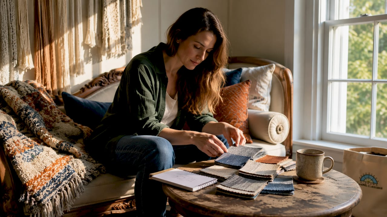
Pro Tip: Always order fabric samples and live with them in the room for at least 48 hours. Testing samples under different lighting prevents costly mistakes, since colors and textures can look dramatically different at noon versus under evening lamps.
Key takeaways
Successful textile decoration depends on applying the 60-30-10 proportion rule, mixing at least three pattern scales, and choosing fabrics matched to each room’s function and mood.
| Point | Details |
|---|---|
| Apply the 60-30-10 rule | Divide textiles into 60% anchor, 30% secondary, and 10% accent for visual balance. |
| Mix three pattern scales | Combine large, medium, and small patterns to create depth without clutter. |
| Contrast matte and shiny fabrics | Pairing light-absorbing and light-reflecting textiles adds richness that color alone cannot. |
| Match fabric to room function | Use durable weaves in high-traffic areas and refined fabrics in formal or low-use spaces. |
| Test samples before buying | Live with fabric swatches in the room for 48 hours to confirm color and texture under real lighting. |
What I’ve learned from years of working with decorative textiles
Most decorating mistakes come from treating textiles as an afterthought. Homeowners choose a paint color, buy furniture, and then try to make fabric work around those decisions. The rooms that feel genuinely luxurious always start with the anchor textile first.
The other thing I’ve found consistently true: texture does more work than color. Two rooms can share the same neutral palette and feel completely different based on whether one uses flat cotton throughout and the other layers wool, velvet, and linen. Mastering texture contrast is what separates interiors that feel warm from those that feel sterile.
Small changes produce outsized results. Swapping two throw pillows for ones with a contrasting texture, or adding a chunky knit throw to a smooth sofa, shifts the entire feel of a room without touching the furniture or paint. These are the moves worth making first.
Repurposing textiles creatively is also underrated. An antique embroidered panel hung on a wall, or a vintage scarf draped over a chair back, adds personality that no new purchase can replicate. Buy those pieces when you find them.
— Marrion
Quality fabrics for your textile projects at Beautifulwindowselgin
Beautifulwindowselgin carries a curated selection of designer drapery fabrics suited to every room and decorating approach, from jacquard satin and embroidered textiles to solid upholstery weaves sold by the yard. The collection supports both DIY decorators working on accent projects and professionals sourcing materials for custom window treatments.

Fabric samples are available to order, so you can test colors and textures in your space before committing. Beautifulwindowselgin also offers custom drapery making services and design consultations, with nationwide shipping from Columbia, SC. For creative projects, the abstract artistic textiles collection offers distinctive patterns well suited to wall décor and statement accent pieces.
FAQ
What is the 60-30-10 rule in textile decorating?
The 60-30-10 rule divides room textiles into three proportional layers: 60% dominant anchor fabric, 30% secondary texture, and 10% statement accent. This ratio maintains visual balance and prevents interiors from feeling either flat or cluttered.
How many pattern scales should I mix in one room?
Mix at least three pattern scales: large, medium, and small. Using a consistent color palette across all three patterns keeps them cohesive rather than chaotic.
What fabrics work best in high-traffic rooms?
Performance fabrics and tightly woven naturals like cotton canvas or wool hold up best in high-traffic areas. They resist pilling, clean more easily, and maintain their appearance through regular use.
How do I use fabric as wall décor?
Hang tapestries, framed textiles, macramé panels, or quilted pieces at eye level, following the same placement logic as framed art. Fabric wall décor also reduces echo, making it a practical choice for rooms with hard floors or high ceilings.
Why should I test fabric samples before buying?
Colors and textures look dramatically different depending on the time of day and light source in a room. Living with samples for at least 48 hours under your actual lighting conditions prevents costly mismatches.
Recommended
- Examples of Decorative Textiles for Home Interiors – Fabric Store in Columbia, SC | Drapery Making Services
- Decorative Textile Selection Process: A 2026 Home Guide – Fabric Store in Columbia, SC | Drapery Making Services
- Types of Decorative Textiles: A 2026 Selection Guide – Fabric Store in Columbia, SC | Drapery Making Services
- Decorative fabric options: a guide for homeowners – Fabric Store in Columbia, SC | Drapery Making Services